
Few industries require as much curbside appeal as real estate: it is a buyer’s market and competition is undeniably fierce.
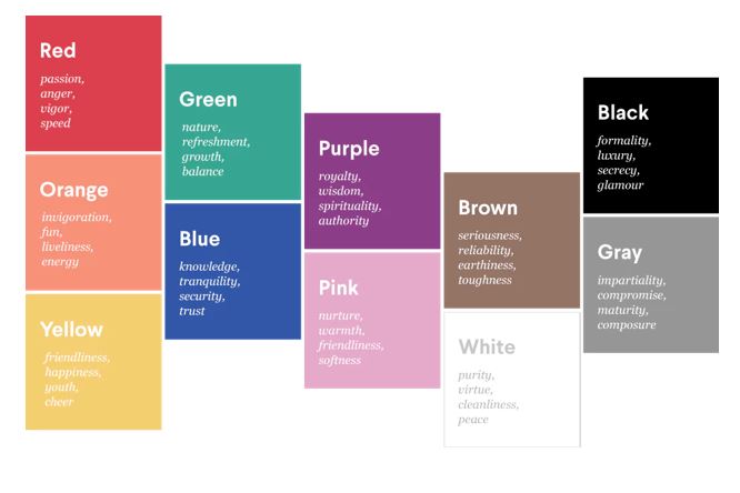
When it comes to attracting customers, the right colours can have a profound effect on how people view and connect emotionally with your brand.
Clients need you to be a safe pair of hands, want to believe you are executing a sale (or search) with their best interests at heart, and they also want to like you. So, how do real estate professionals make sure they are projecting the right value proposition in their branding?
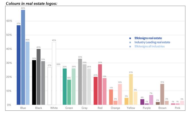
As part of a new report on the Psychology of Logo Color, 99designs analysed 14,000 logos and specifically 600+ real estate logos and branding projects, identifying the most popular colours and most frequently desired brand attributes in both industry-leading brands and 99designs real estate clients. Below are some of the key findings.
Trustworthy shades for real estate
Real estate professionals are a colourful bunch, but did you know the industry has a favourite? It’s blue. A colour known for evoking feelings of security, knowledge and trust, blue features in over two-thirds of industry leaders’ logos, and is also requested in over 50 per cent of real estate design projects on 99designs.
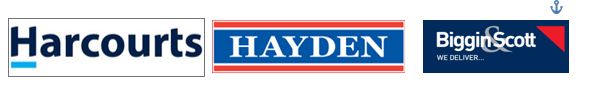
Harcourts, Hayden and Biggin & Scott have all chosen blue as their primary logo colour, and they use it in various ways to communicate different brand traits. While Harcourts is dignified and authoritative in its use of a dark navy, the lighter sky blue accent shade adds a calm, more approachable element to the brand. The other two examples use red, another popular industry colour, as an accent to offset the blue.
Red appears in roughly 29 per cent of real estate leaders’ logos (for example, REA and hockingstuart) perhaps because of its association with modernity, vigour and efficiency — but also because it’s an attention-grabbing shade that is particularly effective on outdoor boards and signage.
But it’s really all about personality
The most important element of choosing the colours for a real estate logo is ensuring that they communicate the values and attributes that are most important to your brand. Real estate clients on 99designs broadly identify their desired brand personalities as being luxurious, mature, modern and serious. This largely explains the prevalence of blue, black and generally quite subdued branding — but there’s always exceptions to a general rule.
Warm colours like yellow and orange rank relatively low in terms of popularity in the real estate industry, but they are a strong choice for accenting given their associations with friendliness, comfort and happiness. After all, every prospective tenant or buyer is looking for a happy home, so it makes sense to capitalise on the emotional connection created when using these colours.
Ray White is a great example of how a real estate brand can successfully move away from the well-worn path of blue and red by combining yellow with a classic, more mature grey to combine contrasting brand attributes.

While there is a lot of research to prove its effectiveness, colour psychology is an inexact science — and just because a colour is not statistically popular, it is not off limits. Sometimes you need to stand out from the crowd, especially as a smaller business disrupting the market or serving a niche clientele. So, if you want to break the mould and try something new, a good first step is to identify the unique value your business brings to a client relationship, and then choose colours that represent and ultimately communicate these personality traits with your customers.
Make Real Estate Business a preferred news source on Google.
