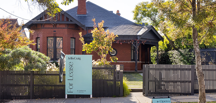
Jellis Craig has unveiled its new brand refresh, which includes a streamlined logo, new graphic design motif, and refreshed colour palette that will help to usher in a new era of growth for the Victorian network.
The new branding suite comes after an 18-month transformation process that was conducted in close collaboration with creative agency Principals.
Jellis Craig CEO, Andrew McCann, said the rebranding would help to future-proof Jellis Craig in the rapidly evolving property landscape, and position the network to further expand its market share and brand recognition.
“We knew our brand was strong, but like any great organisation, we took the opportunity to modernise,” McCann said.
“This brand evolution reflects our commitment to stay ahead of that curve and to visually represent the calibre of our service and team.”
Jellis Craig’s new single-line monograph marks a departure from the previous stacked format, with the new logo moving in a cleaner and more sophisticated direction that aims to further enhance engagement across digital platforms.
As part of the broader transformation, the refreshed brand colours of “carbon, white, sage and linen” are designed to complement one another, and bring a more balanced colour palette to Jellis Craig’s brand identity.
Jellis Craig added that a new graphic design motif was also developed for inclusion on the network’s business cards, boards and brochures, which will all incorporate a new font that will unify the network’s overarching visual narrative.
Principals was appointed to lead the rebranding efforts after a competitive tender process, and delivered an “evolutionary design solution” that retained the hallmarks of Jellis Craig’s branding while also injecting modern flair into its visual identity.
Principals director Tim Riches said the rebranding initiative was a significant undertaking which needed to simultaneously convey “aspirational sophistication and personal approachability” across Jellis Craig’s branding materials.
“This was a nuanced task that required strategic design thinking and a solution with creative flexibility and balance,” Riches said.
Jellis Craig head of marketing, Nichola Emmins, said the rebranding initiative was designed to embody the network’s core values of “connection, integrity and excellence”, and translate these tenets to the network’s current and future clients.
“The new Jellis Criag brand is more than a logo, it’s a statement of who we are today and where we are headed,” Emmins concluded.
Make Real Estate Business a preferred news source on Google.
