After over a century of service to the Sunshine State, the institute has revealed its new brand identity set to underpin the next 100 years.
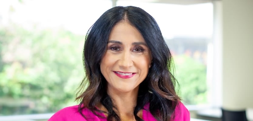
Antonia Mercorella, the Real Estate Institute of Queensland’s (REIQ) chief executive officer, explained that the peak body “felt our brand no longer matched the progressive path we’ve been on — and our members wholeheartedly agree”.
She detailed how the institute conducted research and consultation that illuminated the primary motivations why real estate professionals became and remain REIQ members. Additionally, community members “provided insights into how the REIQ is publicly perceived”.
“We established the REIQ is known and valued for being a trusted industry leader with reputable, reliable, and real-time resources, support, advice, training, and education — in essence, we keep real estate professionals a real step ahead,” she said.
After a century of operating and driving home the needs of Queensland’s real estate stakeholders, Ms Mercorella said the time was right to modernise the brand to align with its core strengths and vision, as well as to stay on track with future direction.
“Our evolution over recent years has been driven by significant investment to strengthen our membership value proposition and our advocacy and policy functions.”
She expressed that the REIQ “are regarded as Australia’s most dominant and effective real estate institute with the profession’s needs at the centre of our products and services”.
Gazing towards the future, she said the institute is “focused on achieving even higher standards of service and empowerment for members, our industry and the Queensland public”.
Ms Mercorella outlined that the REIQ’s “new brand identity encompasses who we are and strive to be — confident, determined, innovative, and member focused”.
“Our branding has a bright colour palette and infinite interconnected triangle which is inspired by the relationship between the REIQ, our industry, and the community,” she added.
The brand’s new look features a new logo with shades of purple, red, and yellow and launched last Thursday (27 October) and will be progressively rolled out across all REIQ products, member assets, and communication channels.
Rebranding is the latest in a host of major moves made by the REIQ this year which has included strongly campaigning for the repeal of Queensland’s controversial land tax system, celebrating the tax’s “icing” early in October, launching a property management training course, and offering a new entry-level membership for agents in the Sunshine State.


